New Zealand Government Data Shows that the Covid Vaccines Make You More Likely To Die from Covid (Not Less)
February 22, 2023 in News by RBN Staff
source: lewrockwell
By Steve Kirsch
Steve Kirsch newsletter
February 22, 2023
Wow. Finally crystal clear government data shows the more you vax, the more likely you are to die from COVID. This is the OPPOSITE of what the US health authorities and medical community told us.
I just learned that the data in this article comes from the results of a New Zealand FOIA request combined with published numbers on the official website (see the entire thread here).
The FOIA request does NOT ask for COVID-related deaths and the results provided were not age-stratified.
Therefore, I am currently unable to replicate these results, even though the results are consistent with other data I have from other sources.
Clearly, the all-cause mortalities are up in New Zealand in 2022 vs. 2021 by 4,500 deaths. Yet there is a high vaccination rate (82% of the entire population of 5.123M people) which they claimed is why they only had 2,500 COVID deaths. So why so many all-cause deaths? Clearly there is something that is killing these people.
Stay tuned while I investigate how the age-stratified per capita numbers were derived. The sources were listed here in the lower left.
I’m writing this at 4am PST on 2/21/23. I hope to have this replicated (or not) shortly.
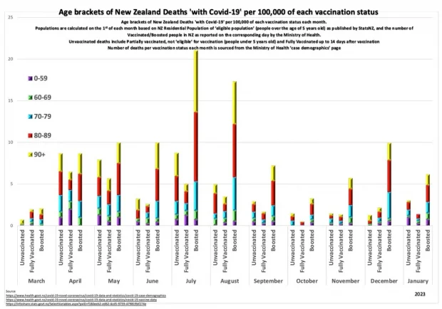
The government data from New Zealand shows that for each age group, the more you vax, the more likely you are to die from COVID.
The data shows that world governments are responsible for millions of excess deaths.
Now you know the truth.
I wasn’t lying. The New Zealand government stats aren’t lying.
The CDC and the health authorities and medical community were all lying to you about the safety of the vaccine. The vaccines are doing exactly the opposite of what they said.
That’s what happens when you give advice based upon belief instead of reality. Had they embraced full data transparency since the start of the pandemic, we could have avoided all of this. Instead, they hid the records that we needed and urged everyone, including pregnant women and kids, to get vaccinated.
Here’s a key graph in a larger size below. This is exactly the type of graph every country should be producing. But they aren’t for some reason. I wonder why?

Here are the three links cited in the figure:
The “unvaccinated” category includes partially vaccinated, not eligible for vaccination, and fully vaccinated up to 14 days after vaccination. Had it been truly “unvaccinated” it’s pretty clear that the numbers for the unvaccinated would be even better. But there is no “cheating” once you are boosted. And you can clearly see the difference there. The numbers were supposed to go down, not up.
These charts basically dump cold water on the claims that the vaccines and boosters keep you from dying from COVID. They do the opposite.
What they don’t show you (because they only look at the risk of dying from COVID) is the rise in all-cause mortality and the number of people disabled and/or permanently injured from the shots. And they don’t show you the pregnancies that never happened, the 20X increase in perinatal deaths, or the dramatic drop in birth rates. So the chart shows an incomplete picture.
It turns out that the mortality and morbidity effects dwarf the negative impact on COVID deaths. But we don’t even have to go there to reject the vaccine.
The key point is that their claimed “key benefit” is not a benefit at all, but an increased risk. This makes it unconscionable for any doctor to support the vaccine.


